

In the Global Professional Accountants Convention (GloPAC), the Institute of Chartered Accountants of India (ICAI) revealed a new logo for Chartered Accountants (CAs). The symbol represents the accounting profession’s commitment to becoming a nation-building partner.
The Institute tweeted on ‘X’,
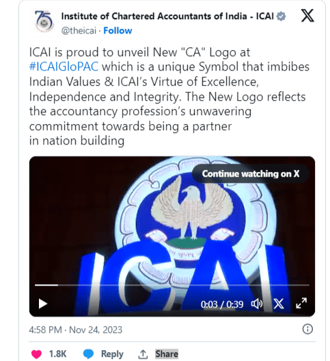
Watch More : https://x.com/theicai/status/1728012794245906869?s=20
The ICAI successfully organized the 21st World Congress of Accountants in 2022. Building on this success, the ICAI is currently launching its inaugural “Global Professional Accountants Convention” (GloPAC), with the goal of curating events of comparable magnitude. The goal is to develop connectivity among the global accounting community, ensuring that they are aware of the world’s ever-changing dynamics.
GloPAC strives to bring together key stakeholders from around the world, including thought leaders, policymakers, standard setters, industry and commerce groups, and financial institutions. The main goal is to have serious discussions and debates about current challenges and future developments in the accounting profession. GloPAC, positioned as a ‘Window to the Future,’ enables comprehension and adaptability to unseen factors in the global economy and regulatory landscape. This convention acts as a venue for leaders to exchange ideas and discussions, providing an indicated path for professional accountant development, and the new logo is set to bring about a fresh shift to the spirit and enthusiasm of the profession of chartered accountancy.
This convention acts as a venue for leaders to exchange ideas and discussions, providing an indicated path for professional accountant development, and the new logo is set to bring about a fresh shift to the spirit and enthusiasm of the profession of chartered accountancy.
Guidelines for the use of new CA logo and colour significance
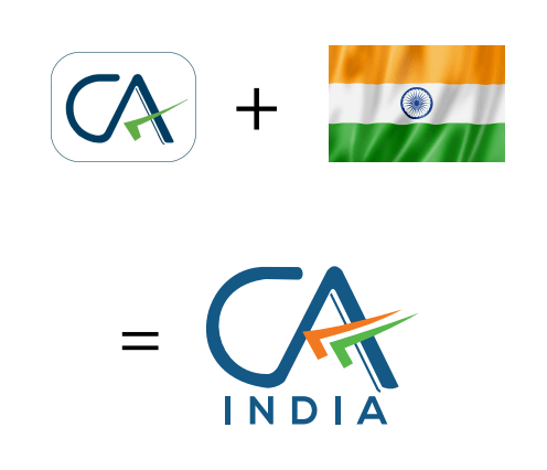
The Institute of Chartered Accountants of India (ICAI) proudly introduced its new logo during the GloPAC Convention, ushering in a changing age for the distinguished accountancy profession. This striking design blends beautifully with the colors of the Indian national flag. This original design not only pays homage to the country’s rich heritage, but it also represents the symbiotic tie between the prestigious accounting profession and the spirit of India. More than just a cosmetic change, the logo serves as a compelling symbol of the basic ideals that have distinguished the ICAI and the accounting profession throughout their long history.
Incorporation of Tricolor
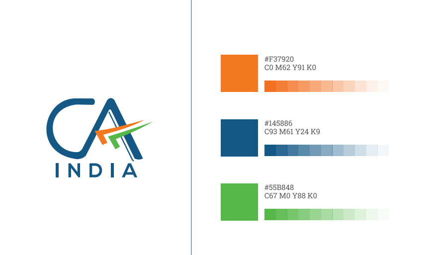
The use of the tricolor in the logo is a striking representation of the Institute’s ties to India. The three colors of the Indian flag represent unity, diversity, and sovereignty, and they reflect the brand’s dedication to serving the people of India and contributing to the progress of the country. The tricolor has been employed in such a way that it suggests velocity, flight, and advancement, highlighting the Institute’s forward-thinking attitude.

Significance of blue color
The predominant color of the new logo is blue, which was inspired by the ICAI logo. Blue is a hue linked with divinity, immortality, bravery, and determination. It reflects immensity, being the color of the sky and ocean, and has long been a part of the Indian cultural, political, and social environment. Blue is also culturally significant, having been a part of Indian tradition for almost 5,000 years.

Adaptability on all platforms
The new logo may be used on all platforms, both digital and analog, which is necessary for a modern brand. This adaptability guarantees that the Institute’s brand is constant across all media, which contributes to the Institute’s identity and credibility. The new logo’s versatility also makes it more accessible to the Institute’s stakeholders, who include members, students, and the general public.
In a nutshell
CA India’s new logo reflects the brand’s relationship to India while maintaining its existing identity. The new logo incorporates the tricolor, emphasizes the relevance of the blue color, and is adaptable across all platforms. The design is intended to be both aesthetically beautiful and culturally meaningful, representing the Institute’s principles and commitment to helping the people of India.
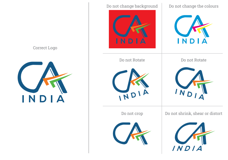
Guidelines (2023) for using the new CA India logo for CA members
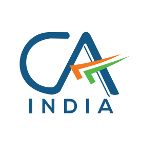
The logo consists of the letters ‘CA’ in blue on a white backdrop, with a tricolor tick mark (upside down). Blue not only stands out against any background, but it also represents creativity, innovation, knowledge, integrity, trust, truth, stability, and depth. The upside-down tick mark, which is commonly used by Chartered Accountants, has been inserted to represent the professional’s wisdom and value.
The word ‘India’ is also included in the design to represent the Institute’s relationship to the India First approach and dedication to serving the Indian economy in the public good.
– The font should not be changed (color, bold/unbold, size). Furthermore, the spacing and size should not vary.
– The color scheme is

– Do not make any changes to the design or colors, including the white backdrop.
– Avoid spinning or tilting the logo clockwise and counterclockwise.
– The logo should not be reduced or manipulated in any way that alters its original proportion.
– While members are urged to utilize the new CA India Logo as it appears on letterheads, visiting cards, and the website, a one-year transition period has been granted for members to use existing stationary/signage replacement, etc.
*Effective from 24th November, 2023.
Also Explore More : https://agrawalclasses.in/
FAQ’s
Nischal Narayanam a child genius from Hyderabad is the country’s youngest chartered accountant.
Born in India on July 23, 1907, R Sivabhogam (Ramasamy) became the country’s first female chartered accountant.
The man recognized as founding the accounting profession in India is Shri Kalyan Subramani Aiyar (1859–1940).
